

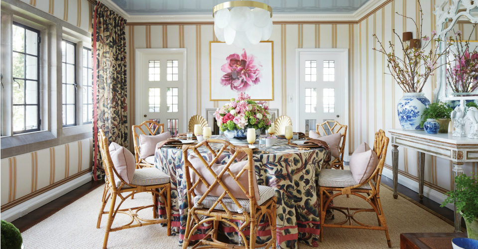
By Alexandra Wood, Owner of Alexandra Wood Design | Main image courtesy of Shelley Johnstone Design
Layering neutrals through fabrics, paint and furniture creates an elegant and timeless feel to any room. Designer Shelley Johnstone Paschke of Shelley Johnstone Design, designed this incredibly chic and stylish dining room, shown above.
“Fabric-adorned walls, linen-printed drapery treatments and vintage Chippendale-style rattan chairs add warmth and a more casual feel to the space. I chose these elements to create a timeless room that is inviting and beautiful,” says Johnstone Paschke.
Personally, I like to design neutral spaces with pops of color through accessories are anything but boring. The end result is an elegant room that will never go out of style.
PATTERN PLAY
Small doses of punchy colors and bold prints add an unexpected layer when paired with classic neutral patterns.

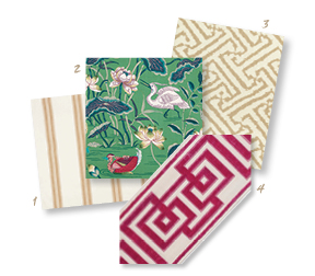
- Schumacher Brentwood Stripe in Neutral, fschumacher.com
- Schumacher Lotus Garden in Jade, fschumacher.com
- China Seas Java Grande in Tan on Tint, quadrillefabrics.com
- Samuel & Sons Rhodes Épinglé Velvet Border in Raspberry, samuelandsons.com
HUE CUES

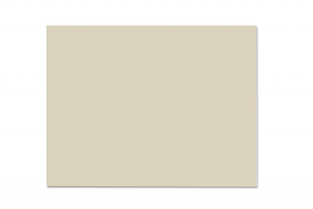
Manchester Tan, Benjamin Moore (HC-81):
A favorite go-to soft neutral, this color is an easygoing beige that works well with many undertones.


Revere Pewter, Benjamin Moore (HC-172):
This paint remains a top pick by designers because of its warmth and adaptability in a space.

Borrowed Light, Farrow & Ball (#235):
Complement your neutral walls with a painted ceiling! Dubbed the perfect light blue, this color works well in rooms with natural light and is hands- down a favorite for interior ceilings.
SHOP THE LOOK
- Caitlin Wilson Sofia rug in sand, starting at $225, caitlinwilson.com
- Dayna side chairs in natural oak, $629 (set of 2), ballarddesigns.com
- Blue and white 9″ Landscape jar, $85, onekingslane.com
- Natural bamboo flatware, $60 (set of 5), potterybarn.com