

Four mood-lifting makeovers that breathed new life and functionality into spaces with gorgeous results.
MINIMALIST CHIC
By Melanie Radzicki McManus | Photography by Shanna Wolf
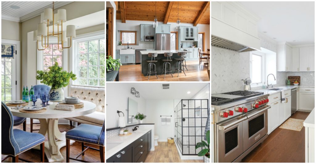
Mary Cullen likes a clean aesthetic. And when she moves into a new home, she prefers to take her time building up color and adding layers. So when she and her husband, George, settled into new digs in Madison’s Maple Bluff two years ago, she knew a kitchen remodel had to be done.
The home’s previous owners loved Arizona, and decorated the kitchen in a Sedona-toned palette, including terra cotta walls and orange-brown granite countertops. And while the room’s island was a welcome addition, it contained a built-in stovetop that dominated the space—an impracticality, given the Cullens have two children under the age of 3. In addition, the wall separating the kitchen and dining room blocked the dining room’s wealth of natural light, plus views of the sunroom, which Mary planned to turn into a playroom.
Removal of the shared wall was actually the couple’s first priority. After the couple tapped Jeremy Olson of New Way Remodeling for the job, he discovered a half-inch transition between the kitchen and dining room floors. If the wall came down, both floors would have to be replaced. That being the case, the Cullens decided to do both projects simultaneously.
Mary did most of the design work herself, tapping Alex Wood of Alexandra Wood Design for some consulting. To lighten the kitchen, Mary selected modern white-painted cabinetry, adding brass pulls to match the rest of the home’s brass hardware. She swapped the dark countertops for a light marbled quartz, then added a much larger island—sans stovetop.
Since the decorative hood for her new Wolf range needed to be installed on a sturdy exterior wall, Mary located the stove and hood on the same wall as the sink, which looks out to the home’s backyard. A new stainless steel Sub-Zero refrigerator with French doors went in, an improvement over the space-hogging, single-door version it replaced. And neutral, chocolate-toned oak flooring erased the golden tones that emanated from the prior maple planks.
But the pièce de résistance, according to Mary, is the gray-and- white herringbone tile that runs from the countertops to the ceiling on the exterior wall.
“I was nervous about it,” she says. “But once it was up, it became my favorite part of the kitchen. It’s definitely a win.”
Wood agrees, adding the overall result is a kitchen with a classic, timeless look. “So many people try to do trendy things,” she says, “but sometimes simple is better.”
A BATHROOM BEAUTY
By Shayna Mace | Photography courtesy of Kowalske Kitchen & Bath
When Elise and Mitch Murn purchased their Delafield home in June 2016, the downtown Milwaukee transplants were looking to set down roots in a quieter area that was still close enough to family and things to do. They loved the home and location—but weren’t in love with the master bathroom layout.
Puzzlingly, their master bathroom had a stand-up shower and another separate bathtub and shower. A small alcove housed the toilet. The bathroom connected to their master closet and another doorway in the back of the bathroom led to the guest bedroom, eliminating any privacy the couple wanted in their space. In other words, it was cramped, closed- off and non-functional. They also desired to update the former color palette of tan and brown to something fresh and contemporary, like the rest of their home. They consulted with Kowalske Kitchen & Bath to reimagine their space.
“I wanted to streamline the bathroom and the closet so that it had much more circulation space so that we had room to actually use the space more productively,” says Kowalske designer Christina Kolb. “I wanted to give them a bigger shower and vanity, and make [it] feel more open.”
The Kowalske team closed off access to the master closet from the bathroom and shifted the bathroom door to the right. (They added another doorway to the left from the bedroom into the closet). They also sealed off the second doorway access from the guest bathroom. The team moved the toilet to the back left corner of the bathroom, and installed a new five-foot-by-almost-three-foot shower in the back right corner. The finishing touch was a seven-foot-long double vanity to give the couple plenty of space.
Elise says she deferred to Kolb on much of the design specifics— but gave her ideas on what they wanted to space to feel like, using a gray, black and white color scheme and emphasizing the new, open space. The bathroom’s luxury vinyl plank flooring, honeycomb tile accents in the vanity and shower, black DreamLine shower enclosure and contemporary sconces all quietly convey relaxed style.
“[Their home] has a light, modern, young family feel,” says Kolb. “So, I wanted to carry that into the master bathroom [but] add in more adult touches so that it felt like an escape suite.”
The Murns love their new space, which won a Gold Remodeler of the Year award from the Milwaukee chapter of the National Association of the Remodeling Industry in 2019.
“I just love the lightness and the modern feel of the space,” says Elise.
COUNTRY CHARM
By Shayna Mace | Photography by Shanna Wolf
Jill and Larry Gierach live in their “seven acres of heaven” in Fort Atkinson, down a quiet country road. Since 2002, the couple have loved their A-frame home with its rustic charm. But with Larry’s impending retirement a few years ago, Jill knew that their tight, galley-style kitchen was quickly outliving its usefulness. Since Larry’s job was out of town, he only stayed at home on the weekends, so the kitchen’s layout didn’t affect their day-to-day lives as much. But with Larry being home 24/7, it was time to make some changes in their kitchen and great room.
“We couldn’t be in the kitchen at the same time. If one person opened the refrigerator, you were stuck,” explains Jill.
A peninsula closed off the kitchen, limiting traffic flow and creating functionality headaches. Jill consulted Shannon Figaro, founder and principal designer of Fig Interiors out of Madison, to help out.
“Jill and Larry were wonderful to work with from the initial meeting. They told me their pain points and the kitchen was not conducive to their lifestyle and the flow wasn’t the best. The peninsula was limiting their ability to enter the space with groceries. They’re baby boomers, so they wanted ease of use, some of the appliances replaced—essentially, they wanted an overhaul,” says Figaro.
Over a six-month period, Figaro and her team revamped the Gierach’s kitchen and great room. In the kitchen, new cabinetry by Curran Cabinetry & Design, Cambria quartz countertops and appliances from Grand Appliance and TV were installed. A kitchen island was swapped in for the peninsula. An updated window over the sink replaced the old, non-functional one. In the dining area, Curran built a custom hutch to house Jill’s pottery pieces as well as a coffee and wine bar. Finishing touches included an apron sink, subway tile backsplash, barstools from Restoration Hardware and pendant lights from Madison Lighting.
The carpeting was ripped out in the living room and replaced with hardwood floors, stained to match the Gierach’s existing floors to create a cohesive feel between spaces. Since the A-frame was sheathed in knotty pine paneling throughout the entire first floor, Figaro suggested the paneling be removed in the kitchen and an adjacent wall to minimize busyness and let the new cabinetry shine. (The paneling was left throughout the rest of the room to preserve character.) Finally, the rustic wood staircase railing was taken down and replaced with a steel cable version for a contemporary touch.
“We were able to transform the space for the better, hitting the nail on the head with the goals for Jill and Larry,” says Figaro. “I’ve seen them enjoying the space with their family over and over again. That’s the best part to me, when I can see homeowners using the space exactly how they describe they would like to in our initial meetings.”
For Jill, an unexpected perk came with the kitchen transformation: “I had a husband who never cooked—and he’s loving to cook. He’s in here all of the time, and it’s changed that man’s life. [The kitchen has] opened a whole new way of using the space and bringing people together.”
SIMPLE BUT STUNNING
By Shayna Mace | Photography by Michael Kaskel
Making over a space doesn’t always mean you have to spend a lot of money and weeks (or months) of time. It can be as simple as vision and creative energy. Such was the case for the breakfast nook that was part of a kitchen makeover project for an Illinois-based family.
The homeowners originally approached Melinda Cahill and Suzanne Glavin of North Shore Nest, a Glenview, Ill.-based interior design firm, for some advice on rethinking the setup of their living room furnishings. Then, they sought the duo’s expertise for their kitchen, which lacked functionality. Surprisingly, Cahill and Glavin recommended that they reconfigure the kitchen to define it from the living room and provide separation for the two spaces.
“We closed off the space a little bit, which is contrary to a lot of people’s thinking. But, it defined the space,” explains Glavin.
As part of the kitchen revamp, the homeowners wanted to be able to effectively use the eat-in area of the kitchen with a bay window that housed a round dining table and chairs. Although it worked before, the homeowners wanted to make it cozier and more inviting. Cahill and Glavin got to work reimagining the breakfast nook. A new creamy white table by Tritter Feefer was swapped in for the family’s old, dark, cherry table. Comfortable upholstered chairs with white piping and nailhead trim swathed in durable indoor/outdoor fabric by Mr. and Mrs. Howard for Sherrill Furniture lend a luxe feel to the spot. A fashionable yet functional Lillian August tufted banquette occupies one side of the table for another comfortable seating option. The banquette touches on the popularity of built-in seating in dining areas, but is actually a stand-alone furniture piece.
“Don’t be afraid to put furniture or a bench against a window. When we propose different layouts [to clients], they think, ‘I can’t put things in front of a window.’ You can. It doesn’t obstruct any view when you’re standing there, and, you don’t have to have three feet behind a bench. So, you’ve gained three feet in the room by using that banquette,” says Glavin.
Other simple designer touches to the space included a new statement light fixture by Visual Comfort, shiplap detail on the ceiling (throughout the entire kitchen) and custom window treatments. Cahill and Glavin were thrilled with the final results, and so was the family.
“I think any time we can get in bench seating … I think it’s so much more inviting and interesting than a bunch of chairs around a table. Mixing and matching different fabrics created an unexpected look that wasn’t so matchy-matchy,” says Cahill. “[The family] loves it. They use [the breakfast nook] and sit together more. We love to hear that [spaces we design] bring people together and that they’re enjoying it—because this one does invite you in, and you want to sit there.”
This article was featured in the Madison: Spring 2020 issue. For more photos of featured Madison homes, visit the Madison Gallery page.