About two years ago, Nadia and Bob Webster moved to a spacious condo on Nagawicka Lake. They sought a lower-maintenance place that would still afford them the chance to be on the water—without the lawn and yard care. However, the couple knew they wanted to update the place. “The previous owners had done some updating, but we decided to change it. It was traditional before, and we really wanted to take it to a transitional-modern style. And then, one thing led to another!”
Initially, the Websters consulted with Dream House Dream Kitchens to overhaul the kitchen—but then decided to redo several spaces in the condo, including the laundry area, living room, much of the upstairs and the bathrooms.
Their kitchen makeover yielded stunning results. What was once a closed-off space became an open and sunny room that easily flows into the dining and living room for a family-friendly, functional space.
TIME TO IMPROVE
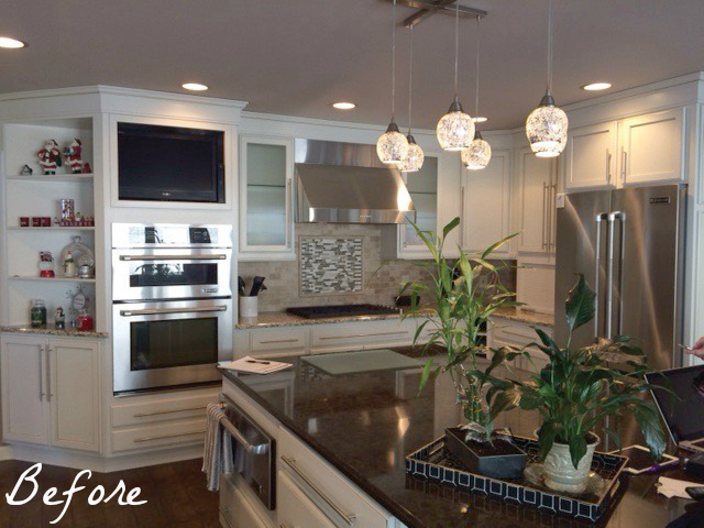
In the kitchen’s old floor plan, a wall with a cutout separated it from the dining and living rooms.
“In our previous homes, we’d always had a really open space, so that’s what we wanted,” explains Nadia. “We wanted that wall down.”
The Websters worked with Dream House Dream Kitchen’s sales director Sara Alswager and CKD and senior designer Tani Nate on a new kitchen footprint.. After the wall came out, the designers reconfigured almost everything in the kitchen to improve the functionality. The Websters selected a new nine-foot-long island to take the place of the irregularly-shaped one that was there before.
“We wanted flexible island seating. And we have five grandchildren, so now we have five chairs that can sit at the island. They love being able to line up to eat here when they come!”
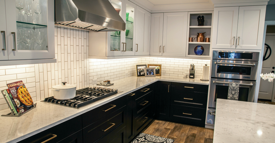
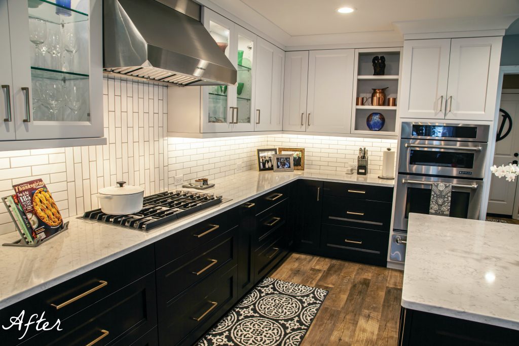
The old laminate flooring also got replaced with hearty luxury vinyl plank flooring and brand-new cabinets by Cabinet City were custom-crafted for the space. Nadia selected modern gold cabinet hardware and a faucet for the space to complement the stainless steel appliances. “I was a little concerned about that—but it’s OK to mix metals,” says Nadia.
“We loved the ‘tuxedo’ cabinet color combination, which is … white cabinet uppers and dark stained base cabinets,” explains Alswager. “It’s a fun twist on a classic look.”
Another nifty feature the Websters pulled in was a coffee bar/beverage center with a beverage chiller and storage space. “It looks like it’s always been there,” notes Nadia. Now guests can pop over while at the dining room table or from the kitchen for a drink refill, or another bottle of wine.
All of the lighting was also carefully updated and chosen from BBC Lighting—like the black pendants above the island and the caged, industrial-look chandelier above the dining room table.
What’s most appealing about the kitchen now is that the couple can see the lake whereas before, their view was blocked. Nadia can name plenty of other design details that she’s happy about after the kitchen’s major makeover.
“I love the size of the island, and the usefulness of it. I’m loving the quartz, because it doesn’t scratch,” she notes. “[It’s great] that the kitchen is white, the cabinets are quality and the space is so open now.”
By Shayna Mace | Photography by James McCarthy

