Categories
Design Featured Transformation

View One Family’s Chic Workout Building

Sports and staying active has always been a way of life for the six-member Hayes family. That extends to their getaway-worthy backyard, complete with a pool and workout building.

When the pool was installed by Brinkman Pools in 2021, mom Jocelyn requested that a concrete pad be poured at one end with the intention of adding a workout room there eventually. She and her husband, Joel, worked with Brad Augustson of Augustson Homes to complete their workout building in 2022.

The family loves it, Jocelyn says.

“We just thought that this [room] would be a great solution that everybody could get use out of.”

By Shayna Mace | Photography by Holly Leitner

MORE ABOUT THIS HOME

Shown in the photos:

  • The workout room houses a Peloton treadmill and bicycle, a large weight machine and free weights. A small AC/heat unit keeps the building comfortable year-round.
  • The durable vinyl plank flooring can easily withstand workouts.
  • Board-and-batten siding and black-trimmed windows and French doors give the workout building a clean exterior look.
  • A fridge keeps beverages cold for the family. The four Hayes kids, which range in age from 11 to 18 years old, use the room constantly, along with Jocelyn and her husband, Joel.
Categories
Design Inspired Interior

How to Use Chambray Blue in Your Interiors

Kate Kazlo, founder & owner of The Home Market & Kate Kazlo Interiors in Milwaukee, creates designs and interiors that are classic, timeless and fresh.

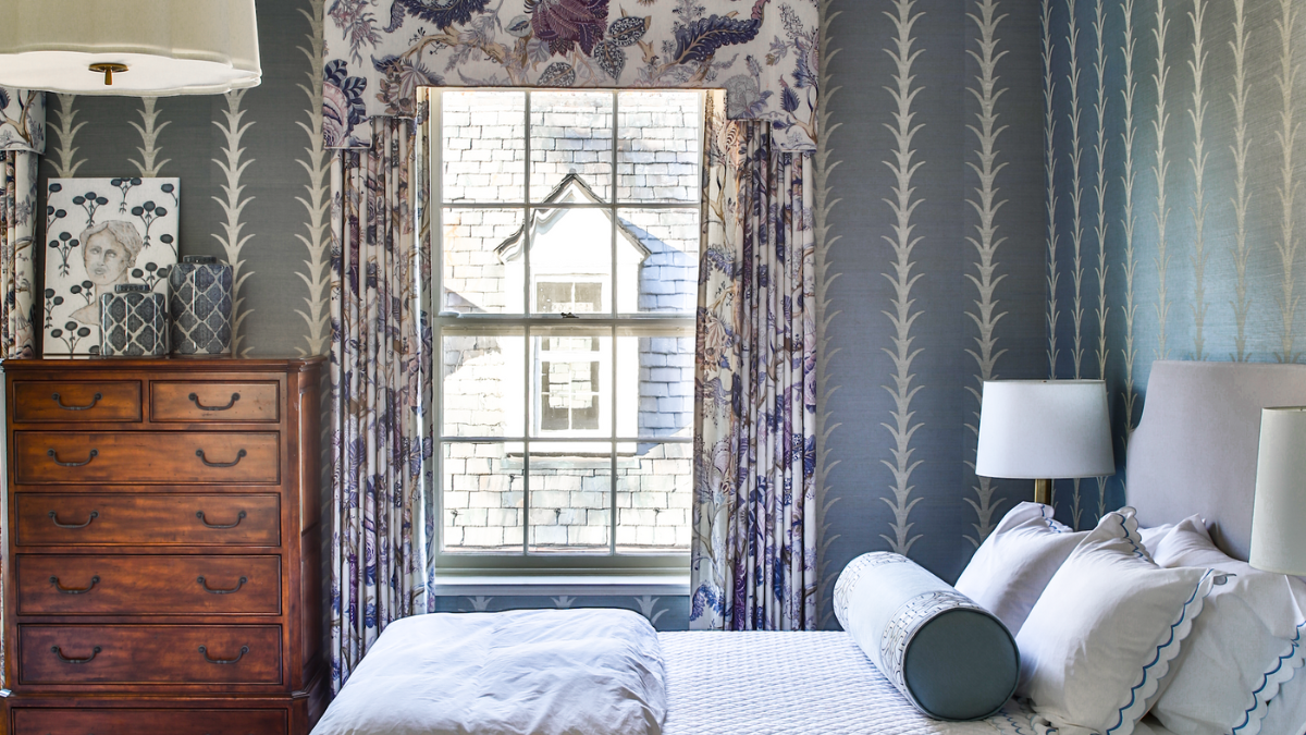
“My client gave me free rein in their second-floor guest bedroom at their country farmhouse. I wanted the space to have a traditional feel, but made it fresh by mixing a lot of bold patterns and pretty textures. I chose chambray blue as the main color because it is versatile and soothing for a bedroom. I incorporated my client’s existing antique brown highboy dresser, as it was a family heirloom, and added brass bedside table lamps to enhance the traditional charm of the space.”

Produced by Alexandra Wood, @alexandrawooddesign

Pattern Play

Left to right:

Shop the Look

Left to right:

Hue Cues

Left to right:

  • SELVEDGE, Farrow & Ball (No. 306): This color works well in low- light spaces and creates a warm and inviting atmosphere. It’s well suited for bedrooms or rooms that you spend a lot of time in.
  • THE EARLY STUFF, Backdrop Paints by Schumacher (BD175102801): A clean, cool and crisp blue with a hint of gray. A perfect color to use in any space where you want a pop of blue.
  • PAPER WHITE, Benjamin Moore (OC-55): A white color with undertones of gray and blue. This color would make a great choice for a soothing, coastal-inspired space where you want a subtle hint of blue.
Categories
Design Featured The Edit

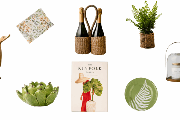
Make a Splash with Blue Décor

Styling and Photography by Holly Leitner

Embrace this vibrant color trend in your décor.

Clockwise from top left:

Categories
Design The Edit

7 Neutral Home Décor Pieces for Your Home

Styling and photography by Holly Leitner

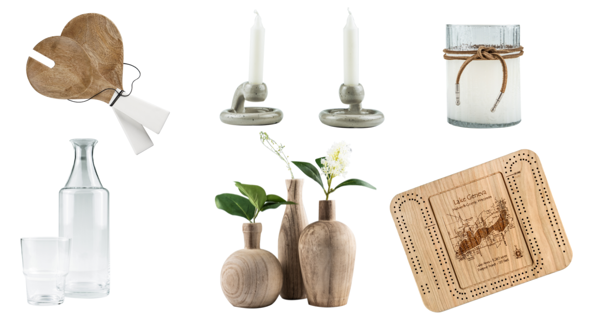
Home décor pieces in neutrals and wood tones quietly enhance any space.

Clockwise from top left:

Categories
Design Inspired Interior

Brown: Anything but Boring

Interior Design: Nicholas Konzal, Nicholas Carl Design | Photography: Amy Lamb, Native House Photography | Produced by Alexandra Wood

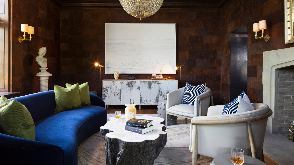
Nicholas Konzal of Nicholas Carl Design is a master of creating sophisticated and luxurious one-of-a-kind interiors. His Milwaukee-based, award-winning design firm created a show-stopping space at the 2022 Wisconsin Breast Cancer Showhouse. This moody space proves that brown is anything but boring — it can be captivating.
“I was inspired by the view in this room, but also the function. I designed this space as a secondary hangout to the main living room and first floor. A chance to invite guests for an after-party drink, and to enjoy the fireplace.,” he explains. “I chose the color blue to play as an accent to the brown walls. I needed a powerful color to draw your eye into the space and make you engaged. The navy blue of the sofa was the perfect color to accomplish this.”

Shop the Look

  • Sophia bedside carafe and tumbler, $250, aerin.com
  • Channels blue and cream throw pillow, $180, ariannabell.com
  • Truro side table, $998, serenaandlily.com
  • Capri sofa, $1,995-$6,895, williams-sonoma.com

Pattern Play

Use wallcoverings, trim and fabric to mix and match shades of brown.

  1. Luxor wallcovering in coco/parchment, lisafinetextiles.com
  2. Manila hemp wallcovering in truffle brown, phillipjeffries.com
  3. Ikat Stripe fabric in chestnut brown, mrsalice.com
  4. Capri lipcord in java, schumacher.com

Hues Cues

  • ANNER’S BROWN, Farrow & Ball (No. 255): This rich brown color is warm with a lot of depth. Perfect on millwork or in a powder room to create a moody vibe.
  • TARPLEY BROWN, Benjamin Moore (CW-170): A sophisticated tone that’s ideal for a den or home office where it can be used on walls, trim and ceiling for a luxe feel.
  • BEACHCOMBER, Benjamin Moore (993): A color that’s perfect for those who don’t want to go all-in on brown. Lighter than other colors, it’s a pretty brown hue with undertones of taupe.
Categories
Design Featured Lake Geneva Transformation

A Ravishing Renovation

When Colleen and Jeff Bailet and their daughters, Ava and Isabelle, decided to move back to the Lake Geneva area after a four-year stint in the Bay Area in California, they found a home on a five-acre parcel in Burlington that checked all of their boxes. Despite the property size, the couple knew they wanted to extensively renovate the home’s interior.

“It had a hodgepodge of carpet, tile and various wood [flooring], and we knew we were going to rip it all out. We knew we’d paint the entire house. We wanted to completely gut and transform the primary bathroom and remodel the other bathrooms. The kitchen was going to be reconfigured. And, we wanted to gut a back stairway, entryway and laundry room to expand that into one large area,” Colleen explains.

In other words, they desired a whole-home renovation. The couple turned to Beth Welch of Interior Changes and contractor R.J. Amann of Amann Builders for assistance. Welch helped the couple reimagine the structural changes throughout, and Amann executed the vision.

Some areas, such as the front sitting room, underwent smaller changes, such as reshaping the arched openings that look into the room (see photo gallery below). Amann added an attractive built-in bookcase in Colleen’s office, also located in the front of the home.

Other changes were far more extensive. The couple added an additional entryway into the kitchen to help with traffic flow. They completely reconfigured the kitchen and shuffled the appliances around. They added a kitchen island (painted in Benjamin Moore’s Gentle Gray) and topped it with a quartz countertop. The opening into the adjoining family room was widened by roughly 50% to bring the rooms seamlessly together.

Behind the kitchen, the expanded laundry room came about from stealing some square footage from a small garage entryway. Colleen loves the functionality of the room, which features cabinetry (painted in Benjamin Moore’s Mineral Alloy), an island that’s used for folding laundry and a beautiful marble tile backsplash from Bella Tile & Stone (from which all of the home’s tile was sourced).

“[Our home] was truly transformed. It’s light, it’s airy and comfortable. It’s no longer dated,” says Colleen. “And I feel like each space has been utilized in a very smart way.”

By Shayna Mace | Photography by Shanna Wolf

MORE ABOUT THIS HOME

Shown in the photos:

  • The Ralph Lauren pendant lights are a show-stopper in the kitchen, among other touches.
  • Colleen commissioned a custom painting by Alabama-based artist Liz Lane to fit her office’s bookcase.
  • Pup Rivi lounges in the home’s family room.
  • A Visual Comfort light fixture hangs above Colleen’s desk. The furnishings are from Restoration Hardware.
  • The laundry room is closed off with a stylish barn door.
  • The couple added in luxurious, built-in, tufted banquette seating in the dining room.
  • The Bailet’s laundry room has a soothing white and gray palette. Far from a utilitarian space, Colleen brought in style via the marble backsplash from Bella Tile & Stone, quartz countertops and Visual Comfort light fixtures.
Categories
Design Transformation

A Magical Makeover at Geneva National

As a couple who splits their time between Arizona and Lake Geneva, having a Wisconsin home with an airy, summery feel was essential to homeowners Yvette and Howard Schulz. After renting in Geneva National for over a decade, the couple decided to purchase a residence there as a home base to spend more time with family in the Midwest, including their two-year-old grandson.

When the Schulzes purchased the home, heavy, dark leather furniture and décor filled the place, which was the opposite of the aesthetic they wanted to achieve.

“Our vision was light, bright and airy like a summer home,” says Yvette. “We didn’t want it to be dark and gloomy. We wanted to maintain the open airiness, and … highlight the [home’s many] windows.”

The Schulzes enlisted the help of Theresa Hansen, founder and CEO of Chicago-based Theresa Hansen Interiors. Initially, Yvette and Howard met with Hansen in person. When they returned to Arizona for the winter, they worked with Hansen virtually to complete the majority of the project, and it was finished while they were gone.

“Theresa was very easy to work with. [We were] in Arizona while she worked through the details and got it done,” says Howard. “We worked with her through phone calls, video calls and emails. She found the pieces and had them shipped, stored and installed, so the process was turnkey.”

As snowbirds, the couple wanted their Wisconsin home to have a different feel than their Arizona abode.

“The homeowners’ … winter residence in Arizona [has] deep, warm colors,” says Hansen. “They wanted to lighten it up and have a brighter home when they are in Lake Geneva during the summer months.”

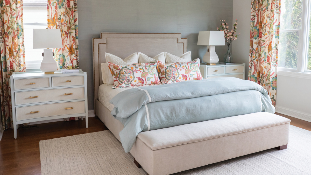
The couple was thoughtful in their design choices. They were inspired by nature, which is reflected in both bedrooms’ aesthetics. The primary bedroom has a neutral base punctuated with peppy pink and orange botanical-print throw pillows and draperies, and a soothing blue bed coverlet.

The couple loves to golf, so bringing in green and blue was a natural choice, too. The guest bedroom incorporates vibrant blues and greens via a statement wall covered in wallpaper by Thibaut, coordinated with matching draperies crafted out of the same pattern.

It was important to the couple that the guest room was multi-functional. The Schulzes selected an extended-length daybed with a trundle bed to accommodate visiting family and friends. The space also has a desk to operate as a home office as well.

Together with Hansen, the couple selected custom furnishings for throughout the home.

“We started with the floor plan, and with custom furniture, we can create any size,” says Hansen. “From there, we selected the fabrics and color stories.”

The furniture’s upholstery is courtesy of Hansen’s private-label line (berhandesigns.com). Because it’s all custom, every item fits flawlessly in each room and accommodates the Schulzes’ needs. For example, the primary bedroom’s bed has a built-in bench at the end of it and a quick lift of the seat reveals storage in it.

Without any demolition or remodeling, the Schulzes achieved a completely refreshed, custom look for their new home — by incorporating a brand-new color palette and furnishings.

“We are excited to enjoy our new, beautiful home with our family and friends,” says Yvette.

By Deanna Kane | Photography by Shanna Wolf

GET THE LOOK

Theresa Hansen, founder and CEO of Theresa Hansen Interiors, used some of these products in the Schulzesʼ guest bedroom.

Categories
Design Inspired Interior

How to Decorate With This Trendy Color

With an impressive portfolio of Wisconsin and international projects, Jane Hogan of Racine-based Jane Hogan Designs blends classic American style with global influences. Her passion for comfortable, yet eye-pleasing design is her trademark.

“While living in Geneva, Switzerland, we had the fortune to live in a gorgeous pre-war apartment with beautiful architectural details and herringbone wood floors. The apartment only had windows on one side, so I wanted to keep the color palette bright and cheerful. Green is a neutral that can be very grounding and soothing in a space. The gold accents were a collection of items that helped to add a touch of sophistication to the room. It really sparkled at night!”

Produced by Alexandra Wood

Pattern Play

Starting top left:

  1. Petite Frond in Melon, heatherchaddocktextiles.com
  2. Rubia Embroidery in Ivory, schumacher.com
  3. Reverse Irish Tile in Grass, alexconroytextiles.com
  4. Varesa Cotton Velvet in Leaf, casabranca.com
  5. Farleigh Lipcord Trim in Champagne, schumacher.com

SHOP THE LOOK

Clockwise, starting at top left:

Hue Cues

  • PEALE GREEN, Benjamin Moore (HC-121): This elegant and timeless green is part of Benjamin Moore’s historical collection. It is a beautifully saturated green that looks gorgeous on walls, cabinets and furniture.
  • WHITE DOVE, Benjamin Moore (OC-17): This designer go-to white is extremely versatile and looks great on walls, trim, cabinetry and other millwork. White Dove maintains enough warmth so that it is not too cool, yet it is not too creamy or yellow.
Categories
Design The Edit

Get the Look: Midcentury Modern Style

By Shelby Deering | Photography by: Dustin Halleck Photography, courtesy Unpatterned (left), Brad Knipstein, courtesy Chairish (right)

Oftentimes, styles come and go, but there’s one design approach that hasn’t budged since it first emerged in the 1940s. Midcentury modern style continues to permeate current homes, with roots that lie at the end of World War II.

“Just as the name suggests, midcentury modern is a design genre that emerged in the middle of the 20th century,” says Tobin Morrison, an interior designer at The Century House in Madison. He says that this style was “very much a product of its time,” since the war forced the U.S. to be extremely thoughtful and intentional about how it made things, “being careful not to gobble up precious materials that might be needed for the war effort.”

Midcentury modern design exploded in popularity in the 1950s and 60s, drawing upon this new age of modernism. With its clean lines, head- turning hues and trademark lighting (such as the eye-catching Sputnik chandelier with a look inspired by the 1957 Russian satellite), midcentury modern has made an indelible print on the design landscape.

Suzanne Augustson, senior interior designer at Curate Design Group, says that’s why midcentury modern design is so iconic — pieces such as the original Herman Miller Eames lounge chair and ottoman continue to be made today, and can be seamlessly incorporated into a range of décor styles.

“At Curate we’re big into combining styles like midcentury modern, traditional and transitional to give interiors some spice and give rooms a collected look,” explains Augustson.

STAYING POWER

While it certainly looks modern by today’s standards, midcentury modern is an enduring style that continues to be timeless and classic.

“Midcentury modern is a classic style because it’s such an understated and easy to pair look,” says Noel Fahden, vice president of merchandising at Chairish, an online vintage marketplace. “The clean lines and minimal details make it easy to incorporate in a variety of styles and spaces.”

As Carly Moeller, registered interior designer and owner of the Chicago- based firm Unpatterned, says, “Function never goes out of style. Whether it’s a sleek, easy-to-clean countertop or a wood furniture piece that doubles as a record cabinet, mid-mod style resonates with today’s appreciation for function and efficiency.”

With more people seeking ease in their interiors, especially since the start of the pandemic, midcentury modern elements can be appreciated just as much today as they were in the last century.

“Though we can’t discount the lasting power of ’Mad Men,’ I also think there are updated ways to incorporate midcentury features that don’t look like a page from a 50’s magazine, but still nod to the style,” Moeller says.

HALLMARKS OF THE STYLE

Today, many interior designers specialize in weaving the midcentury look into interiors for their clients. We asked these experts to share the top hallmarks of this style.

Noel Fahden, Chairish:

  • Futuristic shapes, like Arne Jacobsen’s iconic Egg Chair (and yes, it’s shaped a lot like an egg)
  • Aerodynamic details, like chiseled pencil legs and sculpted brass pulls
  • Brightly-colored upholstery in durable wovens and wools to balance wood furniture pieces
  • Anything in plywood, glass, metal, plastic or vinyl, carrying a minimalistic look and a clean silhouette

Carly Moeller, Unpatterned:

  • Functional pieces
  • An efficient layout or floor plan (think: a kitchen with workstations and practical, yet modern, lighting)
  • Natural materials in medium-tone wood finishes

Tobin Morrison, The Century House:

  • Simplicity and functionality
  • Large patterns and shapes
  • Bold textures

Suzanne Augustson, Curate Design Group:

  • Brass light fixtures, including the Sputnik style and globe silhouettes
  • Solid walnut furnishings
  • Acrylic or lucite pieces

WHERE TO SHOP

These shops offer vintage and brand-new midcentury modern décor:

  • My Sister & Me (Lake Geneva)
  • Lake Geneva Antique Mall
  • Elkhorn Antique Flea Market
  • The Century House (Madison)
  • BC Modern (Milwaukee)

Retro Hues

The experts particularly love these colors for midcentury interiors (left to right):

  • Benjamin Moore, Carolina Gull: A green that nods to the past yet looks decidedly current; this hue looks pleasing when paired with walnut furniture.
  • Farrow & Ball, Bancha: A stunning olive green, this color is bold, yet versatile, when used in a midcentury space with neutrals.
  • Benjamin Moore, Polished Slate: While turquoise is often used in mid-mod designs, this teal takes it down a notch while still having a throwback feel. Pair it with leather furnishings.
Categories
Design Transformation

Take a Look at This Stunning House Makeover

By Shayna Mace | Photography by Shanna Wolf

Like many young couples, Sarah and Chris Klein moved a few times early in their marriage as they entered different life stages. Their first “teeny” home in Maple Bluff was great — but felt too small when they started having kids. They rented for a year while they figured out their next move (literally). After searching several neighborhoods around the city, they landed on University Hill Farms, an area they had become familiar with through friends and coworkers.

The couple had a few non-negotiables that they wanted in their new abode, such as walking distance to an elementary school for their two sons, Rhys and James, a yard and a two-car garage. When they happened upon a stately Colonial-style home in 2010 that checked all of the boxes, they quickly snapped it up.

While the home had all of their must-haves, plus plenty of space for the family of four with four bedrooms and two and a half baths, the home’s front entryway and kitchen left much to be desired. For starters, the front door opened up next to the staircase between the first and second floors, resulting in an extremely tight front entrance. And the side entrance from the garage into the kitchen was much the same — it entered into the middle of the kitchen, where Rhys and James would throw their snowy or muddy shoes and coats on the floor. It was exasperating, says Sarah.

After several years of living there, the couple started brainstorming how to fix the home’s pain points. Looking at other homes in the neighborhood for inspiration, they landed on the idea of using the “massive” and unused front porch for expansion, rather than an addition. To verify this was even possible, the couple met with Denise Clearwood of Pine Clearwood Architects, who coincidentally, had redone an identical Colonial home in their neighborhood. Clearwood put forth a few options for the couple to consider, such as having the garage door enter into their screened porch (that’s on the back of the house), which the couple vetoed. The couple also wanted to remove a wall that separated the kitchen from the dining room, to open up their main living space dramatically.

All in all, the changes were incremental — yet delivered eye- opening results.

Pulling it Together

The biggest improvement — walling in 90 square feet of their 180-square-foot front porch — was a game-changer for the family. Now, guests walk into a roomy entryway and to the right is the brand-new mudroom (the mudroom also has an entry from the garage). Throughout the mudroom are cabinetry and built-in shelves to corral the family’s bags, outdoor items and shoes. A built-in bench under a new window invites guests to sit while taking off muddy or snowy coats and boots. A sink in the corner is used for washing hands after entering the home, or, during parties to keep wine chilled in the ice- filled reservoir. A tea and coffee station in the corner moves traffic out of the kitchen and into the cozy space to savor a sip in the morning. The mudroom also connects to the kitchen — so now the family can walk around the entire first floor instead of dead-ending in the kitchen. The entire space blends in so seamlessly that it’s hard to imagine it wasn’t there in the first place.

But even this small addition had its challenges, say the Kleins. When planning it out, their contractor, Kirk Klumpers of BASK Construction, wasn’t sure it was possible, due to the new addition needing support — and a new support beam would impede on the entryway staircase change. Luckily, they figured it out.

“Our contractor took us aside and he said, ‘we have to figure out a way to make this happen. Because if we don’t, you’re going to regret it.’ The flow of this space now is the greatest thing that’s ever happened to us in this house. Being able to walk all the way through [the house] is great,” says Chris.

Another necessary evil was adding in support footers in the home’s basement to accommodate the renovations, including removing the wall between the kitchen and dining room. Now (as seen on P. 56), the kitchen is flooded with light from the dining room and the screened-in porch.

The kitchen renovation also solved the issue of the family entering in a side door from the garage directly into the kitchen. The door was closed off, and the kitchen was completely reconfigured. Now, appliances flank either wall in the kitchen, and the kitchen’s open floorplan on both sides allows for lively conversation and beautiful views of the front and back yard — something it lacked before. A 3 1⁄2-by-8 foot honed quartz Caesarstone island was also installed to separate the kitchen from the dining room and provide additional seating and hangout space. The island has tons of drawers for storage, which adds even more functionality to the kitchen. The couple’s incredible attention to detail shows throughout each carefully thought-out space. The kitchen island has furniture “legs” to make it appear as a piece of furniture — rather than a built-in element, says Chris. The air switch for the garbage disposal (which is typically next to a kitchen sink faucet) is hidden under the shelving above the sink and is controlled with a wireless push button. The couple opted for open shelving on both walls in the kitchen to add an air of modernity — and show off Sarah’s cookbooks.

Although living through the eight-month renovation wasn’t fun for the family, the couple admit that the joy and functionality their renovated main floor brings them was definitely worth it.

“The foyer is one of my favorite things — just having it really changed our house. The light [we have now], the openness, the airiness. The back of our house always felt light and airy, but the front never did [before] — it felt dark and not very welcoming. And I love the mudroom. Now, it all ties together,” says Sarah.


What to Consider When Doing a Renovation

Sarah and Chris Klein share tips for what worked for them.

Clearly identify what isn’t working

It’s why you’re doing a renovation, right? “Be smart about it and think through things on the front end,” says Chris.
Do you need more storage, more space, better flow? It’s easier to pinpoint exactly what you want at the beginning and be thoughtful, versus changing things down the road.

Think outside the box

The couple hadn’t thought of enclosing part of their porch, but it was beneficial to them to utilize that part of their home for the renovation, since it was already built upon the home’s foundation (therefore, saving some money).

Do your research

Sarah and Chris are detail-oriented, so they researched every aspect of their renovation, from light switches to paint colors. Matching their Vermont green slate tiled entryway was an exhaustive effort for Sarah, until she found a company out East that had the tiles. But if she hadn’t been persistent, they would have had two different flooring types in their foyer.

Ask if there’s a custom solution

In the mudroom, Sarah specifically wanted a tall cabinet that housed just their Dyson vaccum. Chris had a custom panel cover crafted for their dishwasher. They also added extra bracing within
their kitchen island to hide the unsightly bracket that typically goes underneath. It’s all about the details.

Lighting is tricky

The couple both agree it’s worth bringing in a lighting expert or interior designer to help with lighting. “Our contractor was asking about how we wanted things wired,” says Chris. “We didn’t know!” So they consulted with an interior designer friend, who walked through their spaces to help them figure out the lighting. Another takeaway? “Put everything on dimmers,” Chris says.

This article was originally published in BRAVA Magazine‘s January/February 2022 issue. BRAVA Magazine and Lakeshore Living are both published by Nei-Turner Media Group.