By Shayna Mace | Photography by Shanna Wolf
Like many young couples, Sarah and Chris Klein moved a few times early in their marriage as they entered different life stages. Their first “teeny” home in Maple Bluff was great — but felt too small when they started having kids. They rented for a year while they figured out their next move (literally). After searching several neighborhoods around the city, they landed on University Hill Farms, an area they had become familiar with through friends and coworkers.
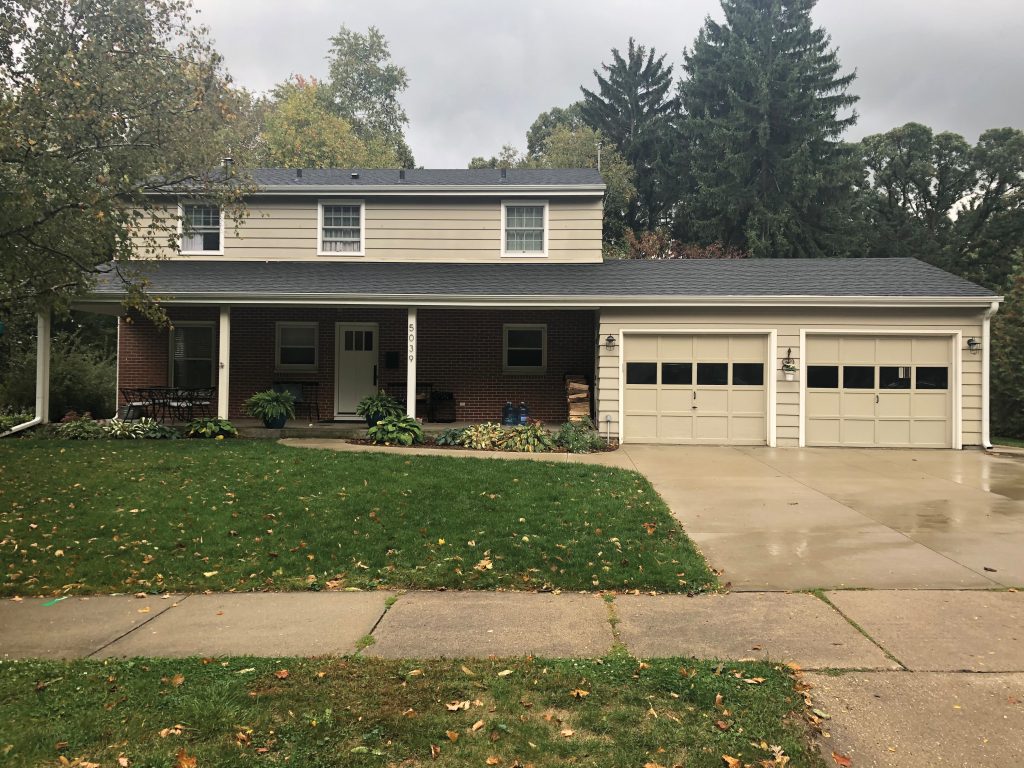
The couple had a few non-negotiables that they wanted in their new abode, such as walking distance to an elementary school for their two sons, Rhys and James, a yard and a two-car garage. When they happened upon a stately Colonial-style home in 2010 that checked all of the boxes, they quickly snapped it up.
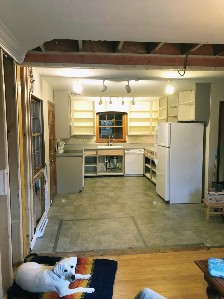
While the home had all of their must-haves, plus plenty of space for the family of four with four bedrooms and two and a half baths, the home’s front entryway and kitchen left much to be desired. For starters, the front door opened up next to the staircase between the first and second floors, resulting in an extremely tight front entrance. And the side entrance from the garage into the kitchen was much the same — it entered into the middle of the kitchen, where Rhys and James would throw their snowy or muddy shoes and coats on the floor. It was exasperating, says Sarah.
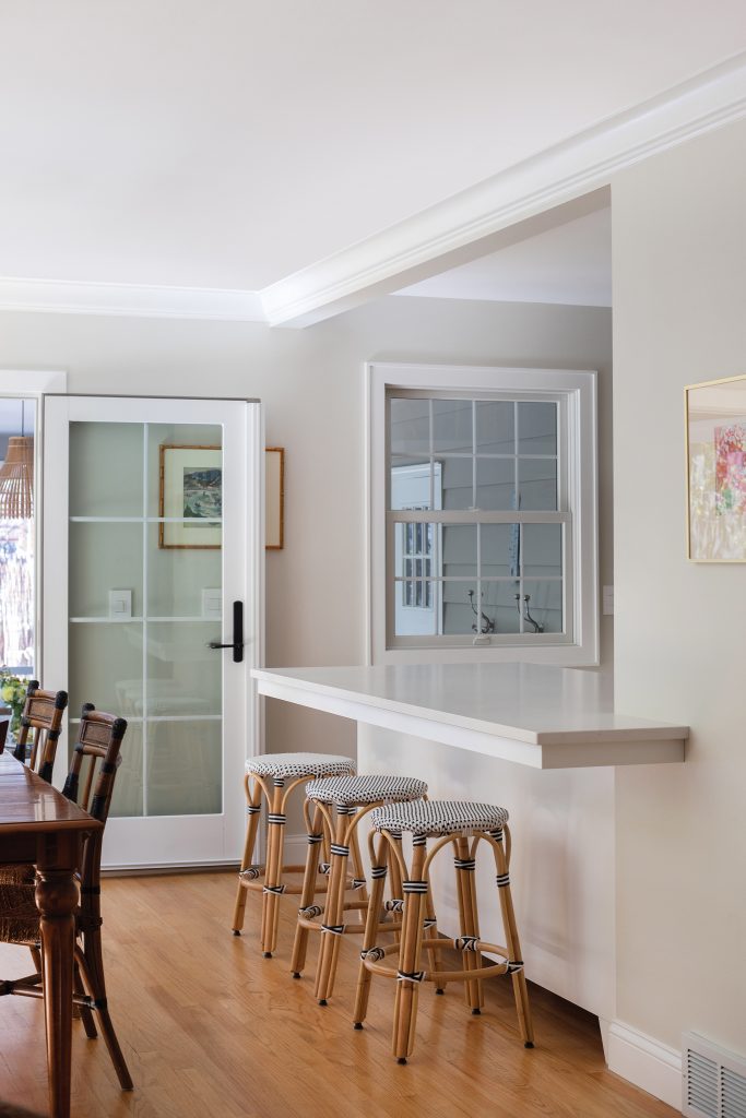
After several years of living there, the couple started brainstorming how to fix the home’s pain points. Looking at other homes in the neighborhood for inspiration, they landed on the idea of using the “massive” and unused front porch for expansion, rather than an addition. To verify this was even possible, the couple met with Denise Clearwood of Pine Clearwood Architects, who coincidentally, had redone an identical Colonial home in their neighborhood. Clearwood put forth a few options for the couple to consider, such as having the garage door enter into their screened porch (that’s on the back of the house), which the couple vetoed. The couple also wanted to remove a wall that separated the kitchen from the dining room, to open up their main living space dramatically.
All in all, the changes were incremental — yet delivered eye- opening results.
Pulling it Together
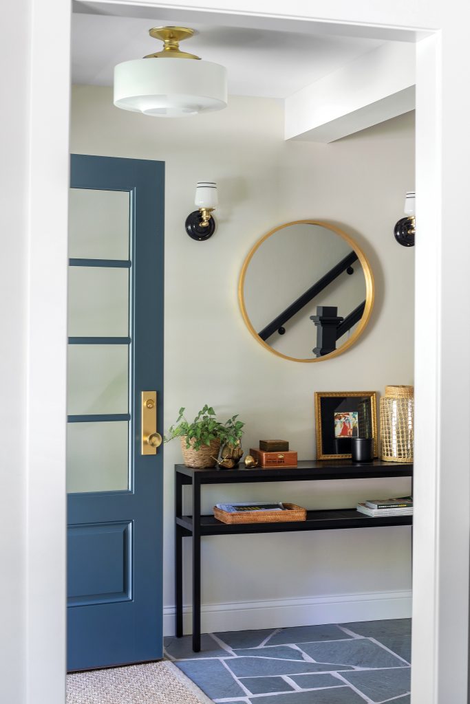
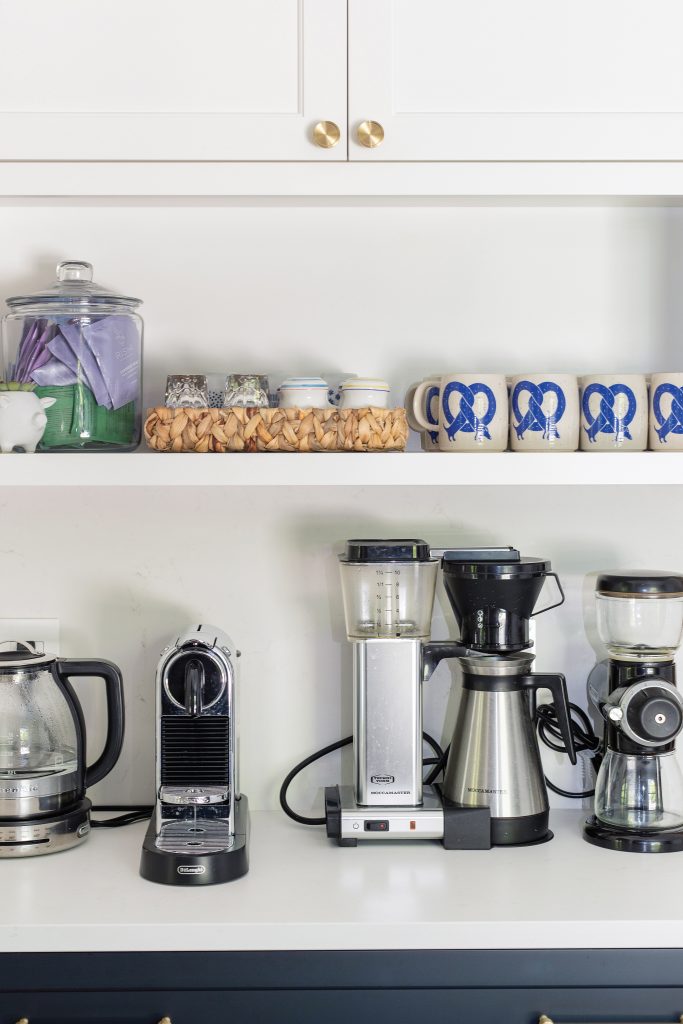
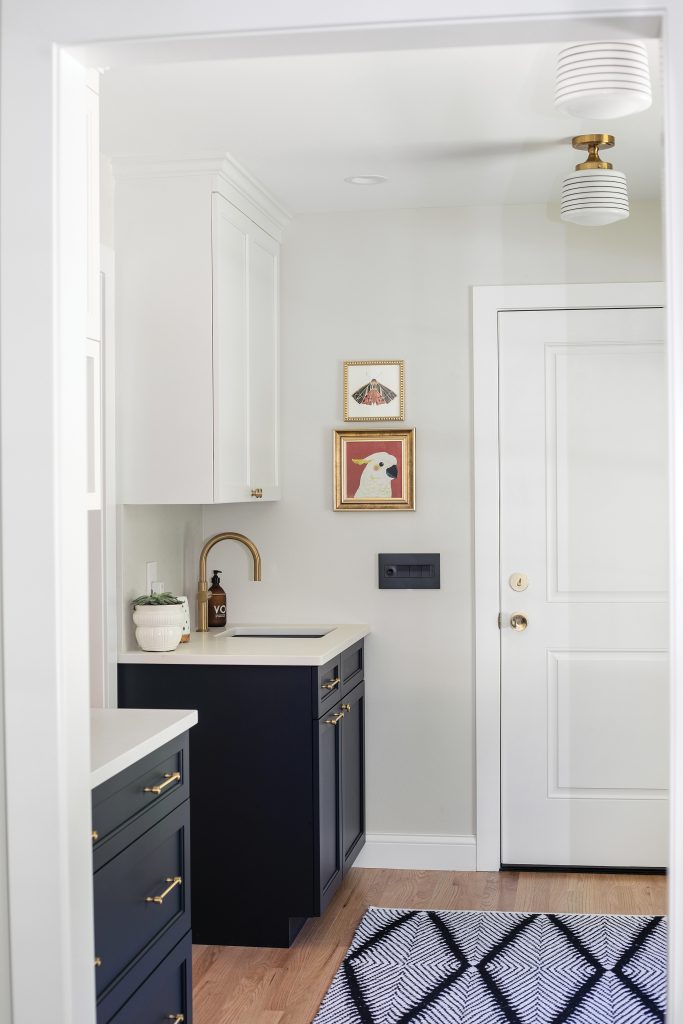
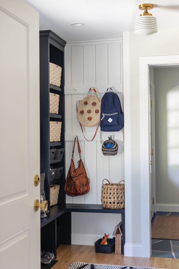
The biggest improvement — walling in 90 square feet of their 180-square-foot front porch — was a game-changer for the family. Now, guests walk into a roomy entryway and to the right is the brand-new mudroom (the mudroom also has an entry from the garage). Throughout the mudroom are cabinetry and built-in shelves to corral the family’s bags, outdoor items and shoes. A built-in bench under a new window invites guests to sit while taking off muddy or snowy coats and boots. A sink in the corner is used for washing hands after entering the home, or, during parties to keep wine chilled in the ice- filled reservoir. A tea and coffee station in the corner moves traffic out of the kitchen and into the cozy space to savor a sip in the morning. The mudroom also connects to the kitchen — so now the family can walk around the entire first floor instead of dead-ending in the kitchen. The entire space blends in so seamlessly that it’s hard to imagine it wasn’t there in the first place.
But even this small addition had its challenges, say the Kleins. When planning it out, their contractor, Kirk Klumpers of BASK Construction, wasn’t sure it was possible, due to the new addition needing support — and a new support beam would impede on the entryway staircase change. Luckily, they figured it out.
“Our contractor took us aside and he said, ‘we have to figure out a way to make this happen. Because if we don’t, you’re going to regret it.’ The flow of this space now is the greatest thing that’s ever happened to us in this house. Being able to walk all the way through [the house] is great,” says Chris.
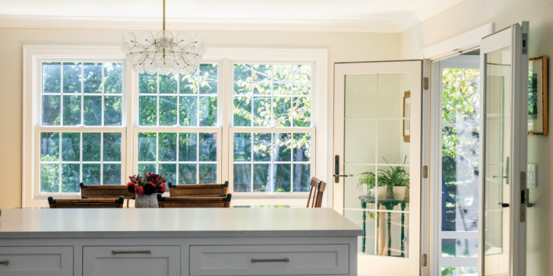
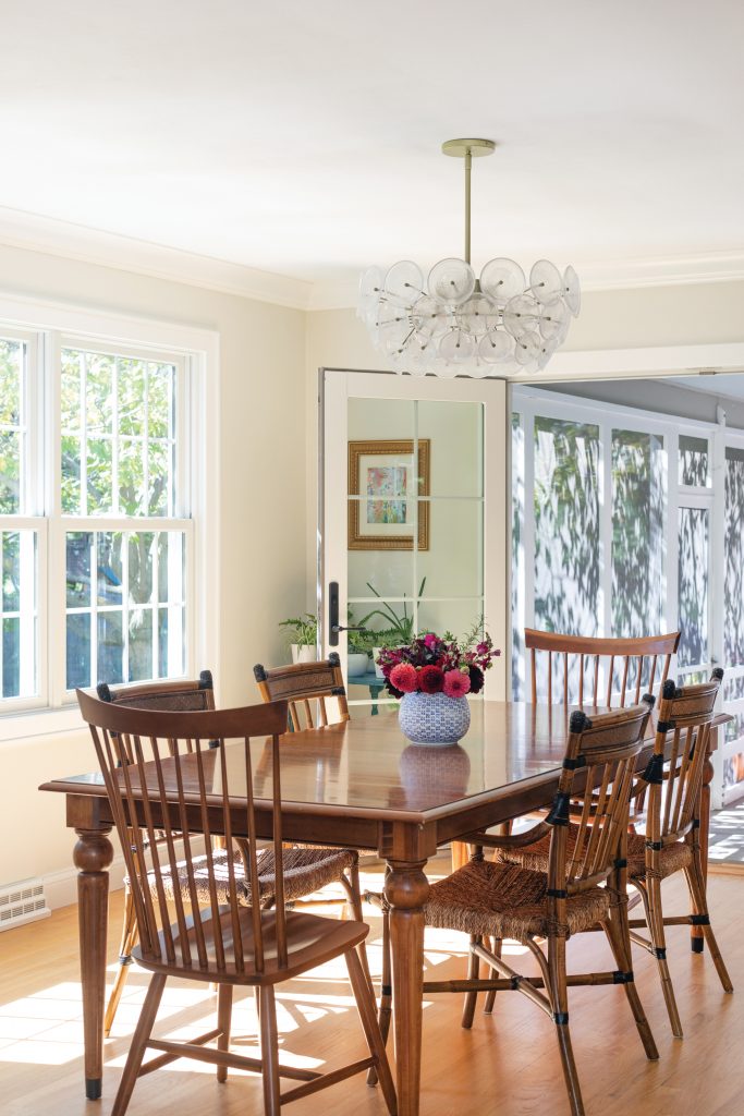
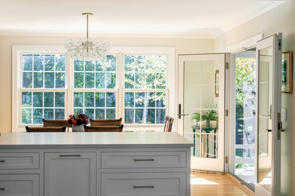
Another necessary evil was adding in support footers in the home’s basement to accommodate the renovations, including removing the wall between the kitchen and dining room. Now (as seen on P. 56), the kitchen is flooded with light from the dining room and the screened-in porch.
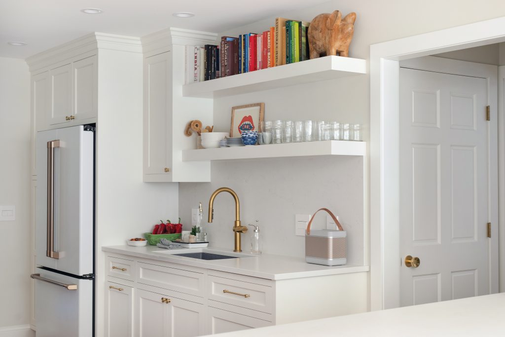
The kitchen renovation also solved the issue of the family entering in a side door from the garage directly into the kitchen. The door was closed off, and the kitchen was completely reconfigured. Now, appliances flank either wall in the kitchen, and the kitchen’s open floorplan on both sides allows for lively conversation and beautiful views of the front and back yard — something it lacked before. A 3 1⁄2-by-8 foot honed quartz Caesarstone island was also installed to separate the kitchen from the dining room and provide additional seating and hangout space. The island has tons of drawers for storage, which adds even more functionality to the kitchen. The couple’s incredible attention to detail shows throughout each carefully thought-out space. The kitchen island has furniture “legs” to make it appear as a piece of furniture — rather than a built-in element, says Chris. The air switch for the garbage disposal (which is typically next to a kitchen sink faucet) is hidden under the shelving above the sink and is controlled with a wireless push button. The couple opted for open shelving on both walls in the kitchen to add an air of modernity — and show off Sarah’s cookbooks.
Although living through the eight-month renovation wasn’t fun for the family, the couple admit that the joy and functionality their renovated main floor brings them was definitely worth it.
“The foyer is one of my favorite things — just having it really changed our house. The light [we have now], the openness, the airiness. The back of our house always felt light and airy, but the front never did [before] — it felt dark and not very welcoming. And I love the mudroom. Now, it all ties together,” says Sarah.
What to Consider When Doing a Renovation
Sarah and Chris Klein share tips for what worked for them.
Clearly identify what isn’t working
It’s why you’re doing a renovation, right? “Be smart about it and think through things on the front end,” says Chris.
Do you need more storage, more space, better flow? It’s easier to pinpoint exactly what you want at the beginning and be thoughtful, versus changing things down the road.
Think outside the box
The couple hadn’t thought of enclosing part of their porch, but it was beneficial to them to utilize that part of their home for the renovation, since it was already built upon the home’s foundation (therefore, saving some money).
Do your research
Sarah and Chris are detail-oriented, so they researched every aspect of their renovation, from light switches to paint colors. Matching their Vermont green slate tiled entryway was an exhaustive effort for Sarah, until she found a company out East that had the tiles. But if she hadn’t been persistent, they would have had two different flooring types in their foyer.
Ask if there’s a custom solution
In the mudroom, Sarah specifically wanted a tall cabinet that housed just their Dyson vaccum. Chris had a custom panel cover crafted for their dishwasher. They also added extra bracing within
their kitchen island to hide the unsightly bracket that typically goes underneath. It’s all about the details.
Lighting is tricky
The couple both agree it’s worth bringing in a lighting expert or interior designer to help with lighting. “Our contractor was asking about how we wanted things wired,” says Chris. “We didn’t know!” So they consulted with an interior designer friend, who walked through their spaces to help them figure out the lighting. Another takeaway? “Put everything on dimmers,” Chris says.
This article was originally published in BRAVA Magazine‘s January/February 2022 issue. BRAVA Magazine and Lakeshore Living are both published by Nei-Turner Media Group.

