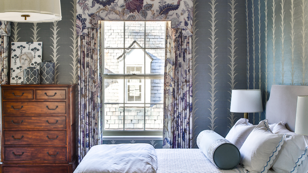
Kate Kazlo, founder & owner of The Home Market & Kate Kazlo Interiors in Milwaukee, creates designs and interiors that are classic, timeless and fresh.
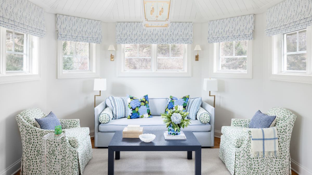
“My client gave me free rein in their second-floor guest bedroom at their country farmhouse. I wanted the space to have a traditional feel, but made it fresh by mixing a lot of bold patterns and pretty textures. I chose chambray blue as the main color because it is versatile and soothing for a bedroom. I incorporated my client’s existing antique brown highboy dresser, as it was a family heirloom, and added brass bedside table lamps to enhance the traditional charm of the space.”
Produced by Alexandra Wood, @alexandrawooddesign
Pattern Play
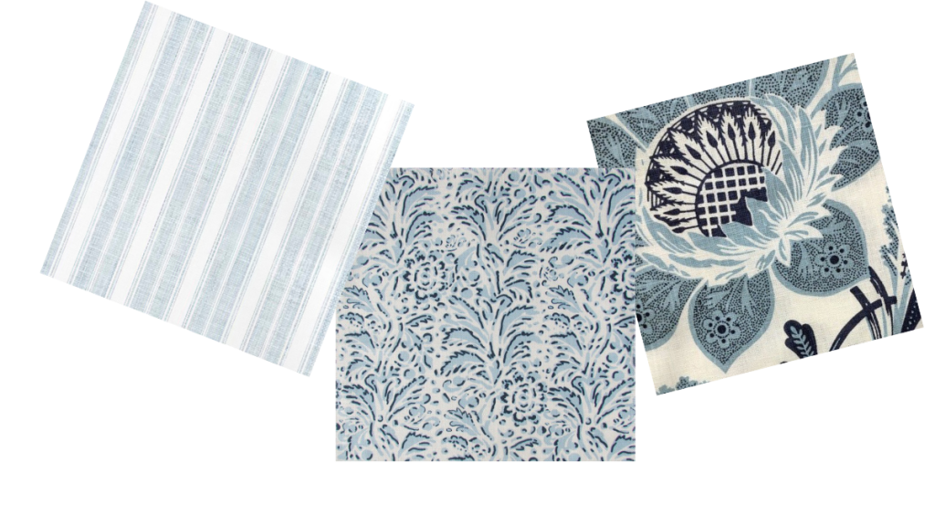
Left to right:
- Branca Stripe small wallcovering in sky, casabranca.com
- Capri Blue Heaven fabric, casabypc.com
- Lorraine Celestina fabric in medium blues, quadrillefabrics.com
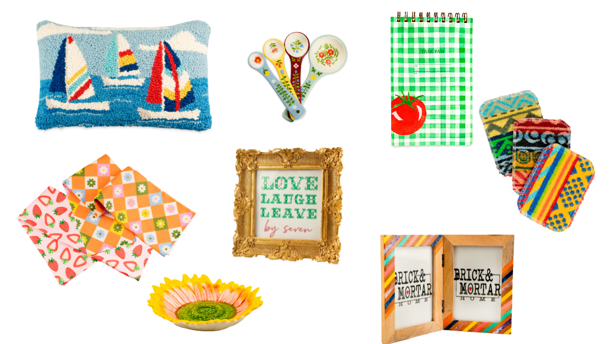
Shop the Look
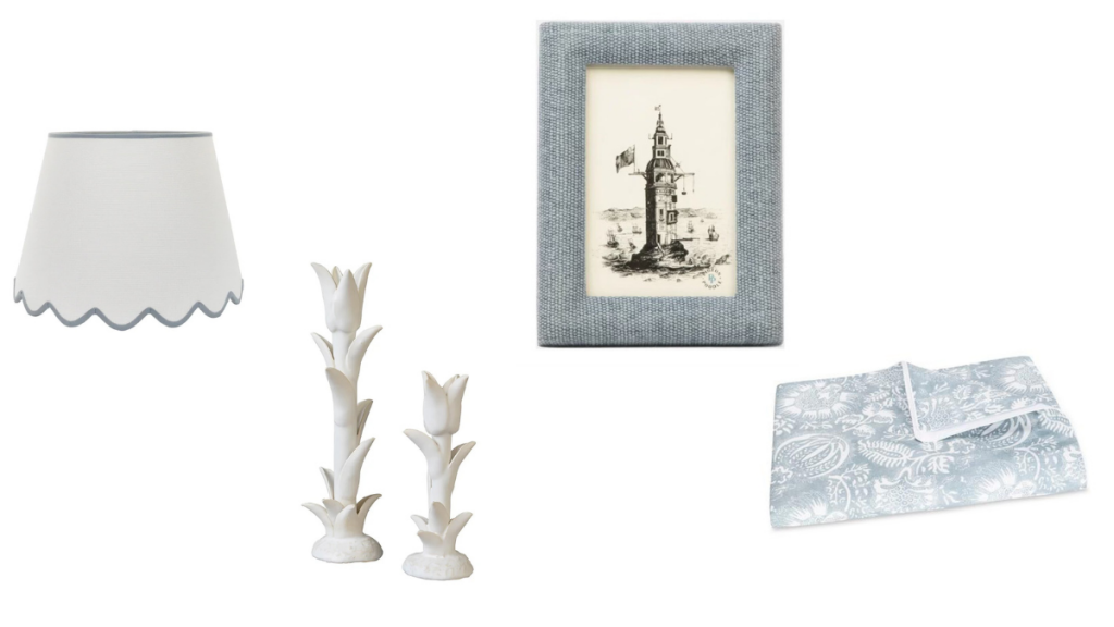
Left to right:
- Scalloped grasscloth lampshade, $180, newportlampandshade.com
- Jean Roger small tulip candlestick, $325, casabranca.com
- Kemi frame, $75, shophomemarket.com
- Granada queen duvet, $624, shophomemarket.com
Hue Cues
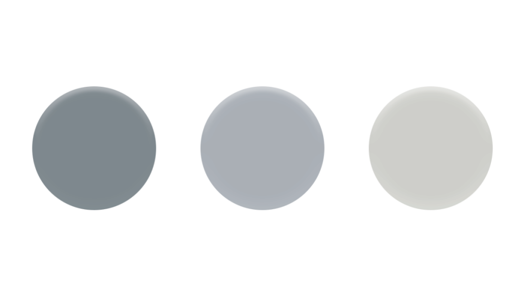
Left to right:
- SELVEDGE, Farrow & Ball (No. 306): This color works well in low- light spaces and creates a warm and inviting atmosphere. It’s well suited for bedrooms or rooms that you spend a lot of time in.
- THE EARLY STUFF, Backdrop Paints by Schumacher (BD175102801): A clean, cool and crisp blue with a hint of gray. A perfect color to use in any space where you want a pop of blue.
- PAPER WHITE, Benjamin Moore (OC-55): A white color with undertones of gray and blue. This color would make a great choice for a soothing, coastal-inspired space where you want a subtle hint of blue.