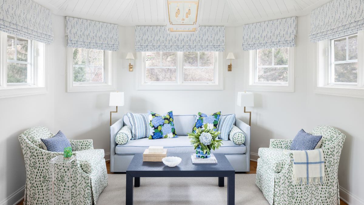
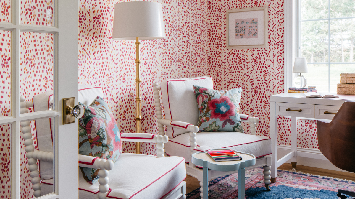
Photography by Margaret Rajic; Interior Design by Margaret Zingale
Margaret Zingale, a Milwaukee-based interior designer at Peabody’s Interiors, is adept at creating timeless, personal spaces and homes that feel layered and lived in. With a keen eye for mixing old and new, her style effortlessly blends classic elements with a fresh perspective. In a recent office project, pink took center stage as an unexpected choice that brought the space to life.
“We started with my client’s existing rug, which featured pink, blue and orange,” she explains. “Rather than replacing it, we used it as inspiration. The pink stood out as fun and fresh.”
To keep the look elevated, she relied on a few tried-and-true design tricks. “Pairing pink with grounding tones, like deep navy or warm neutrals, creates balance and sophistication. It’s all about using color with intention.”
Pattern Play
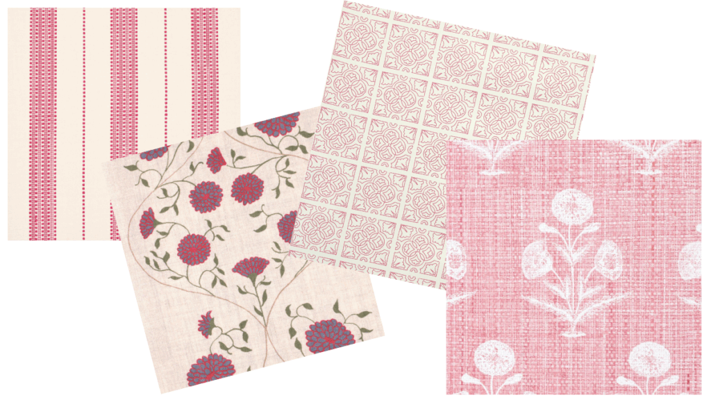
Top to bottom:
- Lubeck Stripe fabric in pink, schumacher.com
- Jaipur Solid fabric in clover/wedgewood/ruby, alexconroytextiles.com
- Irish Tile wallcovering in fuchsia, alexconroytextiles.com
- Papavero Madagascar wallcovering in salmon, casabranca.com
Hue Cues
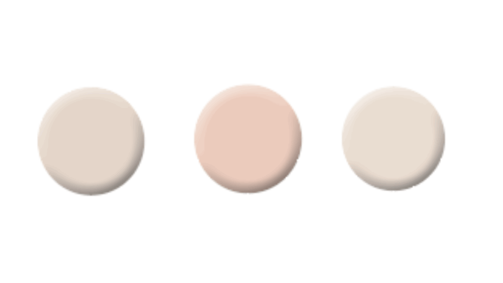
- PINK GROUND, Farrow & Ball (No. 202): This dusty pink hue has yellow pigment that casts a soft blush hue. The shade’s warm, soft and soothing qualities make this color ideal for a bedroom.
- CORAL BUFF, Benjamin Moore (O24): This pale coral hue with touches of pink creates a warm glow that isn’t too overpowering. Use it on a ceiling to draw the eye up without competing with artwork and furnishings.
- TISSUE PINK, Benjamin Moore (1163): This wonderful color with shell undertones is the perfect hue to subtly introduce color into your home without overwhelming other design elements.
Shop the Look
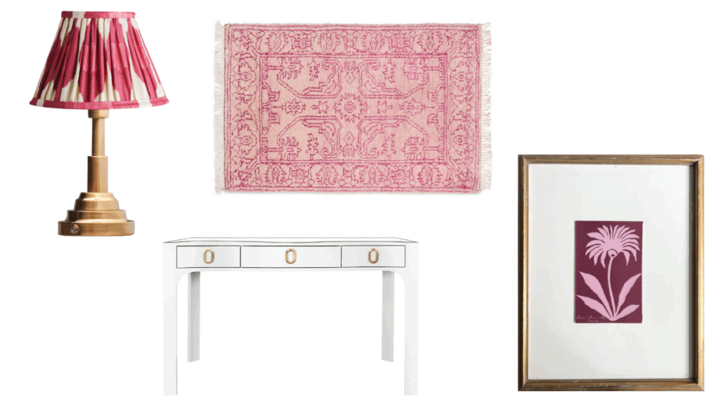
- Earnest cordless table lamp with shade, $225, us.pooky.com
- Desi rug in blush, starting at $295, caitlinwilson.com
- Edie curved desk, $2,375, shopsocietysocial.com
- “Impression de Fleurs No. 15” block print (vintage pink on merlot), $225, reneebouchon.com