By Nikki Kallio
If you’re looking to give your walls or interiors a refresh, today’s color trends are exciting and sophisticated. Vibrant colors and warm neutrals are trending, and Lake Geneva-area interior designers are seeing a desire for rooms that are either warm and organic, or bold and dramatic.
What’s Trending
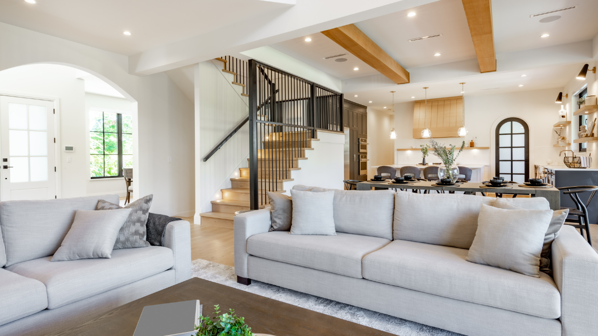
The paint pendulum is swinging toward warmer, more earthy colors — which is a departure from the previously popular grays we’ve seen for many years. Hot hues include ultra-warm putty and mushroom tones, as well as rich, dark blues and greens.
Sometimes these colors are paired together.
“I think in general, there’s a shift towards a more organic feel in design,” says Carly Loobeek of Studio M Interiors.
When it comes to cabinetry colors in particular, Natalie Spiniolas of Tailored Spaces LLC, says, “people are tending to go a little bit deeper with colors — so lots of really strong dark, deep greens and blues [and] blues that are almost on the edge of black. We just did a kitchen in [Sherwin-Williams’] Inkwell … a very, very deep, dark navy.”
Creating a Mood
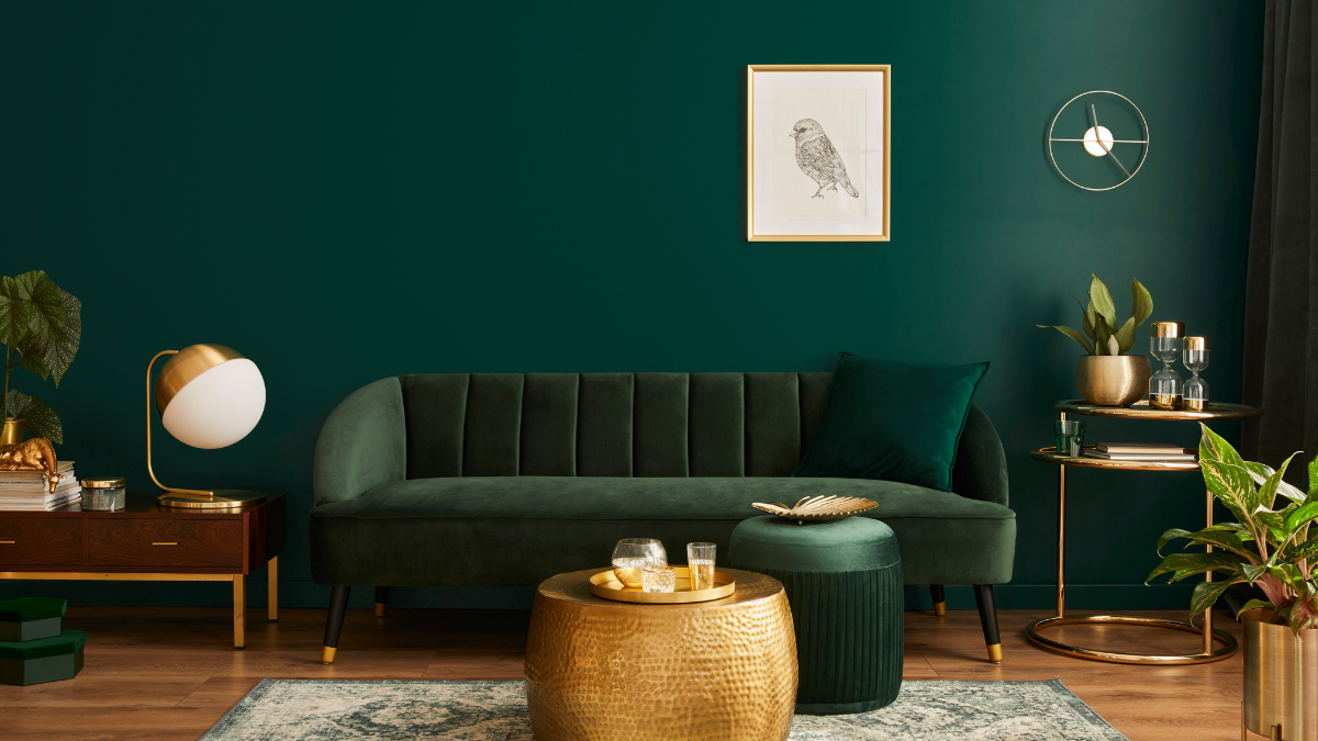
Another intriguing trend is “color drenching,” in which the same paint shade is carried throughout a room on the walls, trim and more, equaling a dramatic look.
“It creates a whole mood, per se, versus just [painting] the walls,” Loobeek says.
Because of its impactful look, a homeowner may opt to color-drench just one room, then have the rest of the home be warm and light, Loobeek says.
A recent project of Loobeek’s folded deep green hues into a home office — incorporating the color right down to the outlets. “That’s the room you might read in, or have a cup of coffee or a cocktail, and it makes it a more intimate space,” she says.
Recently, Spiniolas worked on a cottage remodel that employed a rich green shade (Vintage Vogue by Benjamin Moore, see sidebar) in the kitchen. The maple butcher block countertops provided a lovely, light contrast. “[The space] still had a very … traditional Wisconsin cottage vibe to it, but we paired it with white and gold appliances and accessories, and it was very cute.”
While color-drenched rooms often incorporate dramatic blues and greens, color drenching isn’t limited to rich or vibrant hues — any shade can be used. A recent project Spiniolas worked on used Sherwin-Williams’ Accessible Beige on the walls throughout the entire home as well as in the cabinetry in the kitchen: “[The shade] just moved through very nicely.”
Bringing Personality Into the Home
The COVID-19 pandemic may have played a role in homeowners desiring rich, bold colors as they began to spend more time at home — including working from home offices — and started envisioning spaces that were more inviting and personal.
“Even secondary homes [in Lake Geneva] are being used more frequently, and I think [people are] bringing more of their personality into their homes,” Spiniolas says.
In fact, the sky is the limit when it comes to color for some homeowners, says Spiniolas.
“I think it’s really interesting how much color is making a comeback,” Spiniolas says. “We just saw a pink bathroom coming back. [And] I think a lot of these cabinet companies are taking liberties to do any color that you want on cabinetry now. It’s not as limiting as it used to be.”
People also are going bolder with colorful ceramic tile in bathrooms and kitchens. “It just emits more feeling and more emotion than a home that’s all neutral,” Loobeek says.
Even appliances are becoming more colorful again. “We haven’t seen those in years,” Spiniolas says. “But it’s kind of everywhere, where people are being a little bit more fun.”
Popular Paints
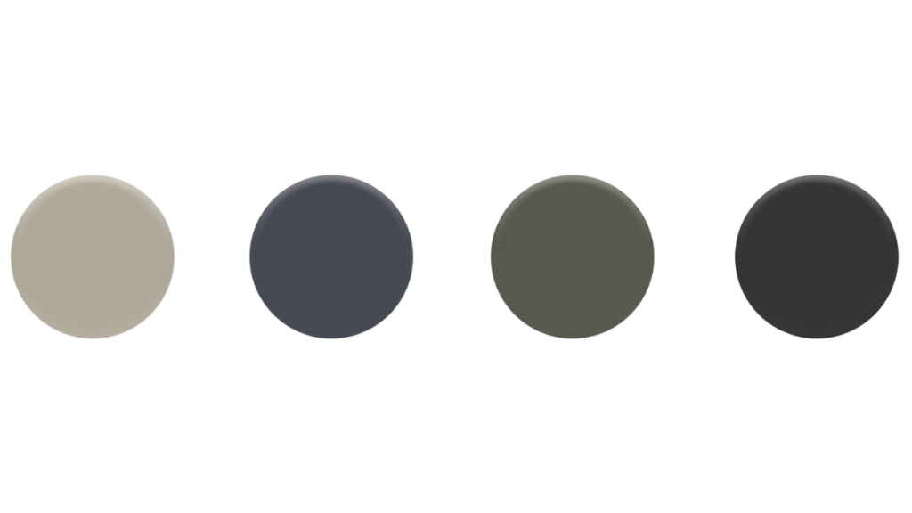
Left to right:
- Sherwin-Williams’ Loggia: Loggia is among the warm putty colors that have been popular for walls and cabinets, says Carly Loobeek of Studio M Interiors. Sherwin-Williams notes it as a light stone gray that is ideal for kitchens and pairs well with a warm red.
- Benjamin Moore’s Hale Navy: This shade of navy is Natalie Spiniolas of Tailored Spaces LLC’s “favorite navy of all time. It’s the perfect depth of blue,” she says. “It’s not too bright … it just reads perfectly navy blue from any distance.”
- Benjamin Moore’s Vintage Vogue: “A beautiful green” shade that is a warm alternative to charcoal, Spiniolas has used Vintage Vogue for an office remodel as well as a kitchen project, which gave the room a cottage-like feel, she says.
- Behr’s Cracked Pepper: The company’s selection for Color of the Year, this soft black pairs well with a variety of warm neutrals and pops of color, such as Behr’s Laguna Blue or Mountain Olive.

